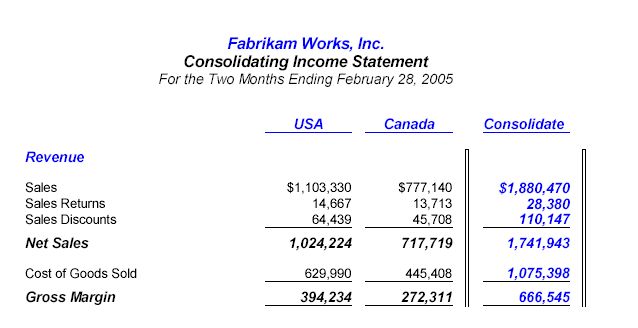
Vertical lines offer improved legibility; in short, they just make reports look better.
Here’s a short example:

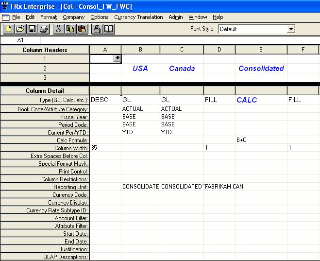
Here’s an overview of how you achieve this look: your column will contain two Fill columns with widths of 1. Your row will reference these columns with Box Begin and Box Complete format codes. Here’s how.
Start by creating your column layout, and use two Fill columns with widths of 1 on either side of the column you want to highlight:

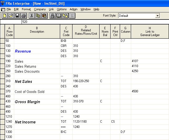
Now here’s an abbreviated version of the row: Note the BXB and BXC format codes with corresponding restriction to columns D and F (the fill columns from the column layout above):

Run the report and you’re done. Depending on your printer driver, the version onscreen may look like one of the lines is solid and the other hollow. This is not the case when it’s printed; both look like the initial example above.
Great suggestion! I have always simply used a FILL column, also with a width of 1, but a format of shaded. This puts a thick line between columns. It also doesn’t require anything in the row format.
That’s a great idea!
I was using the fill as well, but sometimes a line is just a little better.
Any suggestions for the the underline and double underline when exporting to Excel?
They’re pretty tacky, aren’t they? Sometimes I just turn them off and add them in Excel. Uncheck ‘Print underscore rows’ in the worksheet options area of the catalog.
Any way to use the FILL in the Column but not get such a thick line? I’d rather not put it in my row by using the BXB and BXC.
Also trying to determine how to get a row to be shaded completely across the report for a DESC code type. I have set up a new font that includes shading but and can get it to go across columns for GL lines, but for the DESC line it only shades the description itself and the other columns remain blank.
This is website is a great resource!