FRx report with font too small?
Got a report that’s tough to see? We call those ‘real estate’ problems, or too many columns on a page, so that the font gets really small. Here are some ideas.
You could shrink the column widths by one or more. Be sure to test on the consolidation or the unit that has largest numbers. If you see stars (ok, asterisks), you’ll know you’ve gone too far.
If the width is not specified, a GL column defaults to 15. A description column defaults to 30.
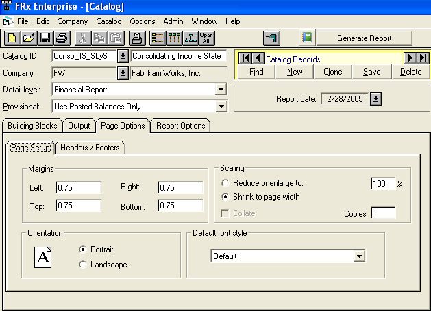
You could also experiment with margins. Best place for this is in the drilldown viewer itself. Run the report once and then play with margins in page setup from the file menu. It adjusts automatically. Once you get a setting you like, go back to the catalog and enter the settings there and save. MUCH faster than changing margins and running the report.
You can also play with reducing and enlarging in Page Options, Page Setup:

Warning: you can burn a good bit of time with this kind of testing! But it’s an investment in the future IMHO (in my humble opinion). Good luck!
Thanks Paul for asking the question!!
Leave a Reply